
Big Ideas for Tiny Spaces:
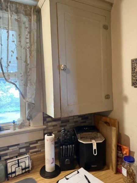
Actual Boccolinis customers photo
3 Transformations for a Cluttered Kitchen Corner
If you look at the corner of your kitchen and feel a creeping sense of clutter-induced claustrophobia, you aren't alone. Small, awkward corners are the main pain points in many older South Jersey homes.
Take, for example, the kitchen nook seen in this actual Boccolini’s customers’ photo. It’s a very common setup: a dated, bulky upper cabinet that feels closed off, a standard laminate countertop, and several small appliances (an air fryer, knife block, cutting boards, paper towels) competing for valuable prep space. Everything fits, but it doesn't feel efficient or useful. It feels chaotic.
We often think that to make a tiny kitchen functional, we must knock down a wall. But sometimes, the most dramatic changes come from intelligently rethinking how we use the existing footprint. A targeted remodel can transform this awkward "customers photo" corner into a space that is not only beautiful but significantly more efficient.
Here are three distinct, professionally designed ways to transform a tight kitchen corner like the one in the customers photo.
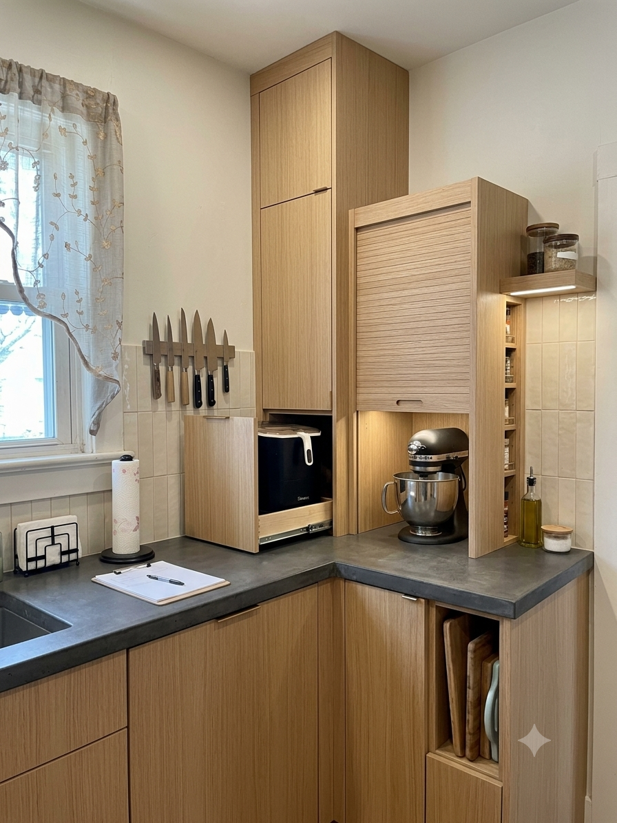
This is an AI image to show what the space COULD look like. Makes it easier for Boccolinis customers to “see” it first
(Image A: The Chef’s Corner) Taller, integrated cabinetry creates a seamless workflow while keeping surfaces sterile and clear.
1. The Ultra-Efficient Chef’s Corner (Maximize Functionality)
In this design approach, we don't try to hide the kitchen's small scale; instead, we lean into its functionality, making every tool an efficient part of the design. We focus on a "mise en place" philosophy, where everything has its dedicated place for high-speed workflow.
The transformation (seen below in Image A) addresses the clutter in the customers photo directly. We’ve removed the bulky closed upper cabinet and the soffit, replacing them with slender, floor-to-ceiling cabinetry that integrated a high-efficiency appliance 'garage.' The original large air fryer is swapped for a compact, smart-oven integrated into the tower cabinet.
This frees up the entire corner countertop, now made of clean, white quartz. The backsplash is updated from the busy existing mosaic to a clean, vertical zellige tile, which draws the eye upward, making the space feel taller.
How This Style Enhances the Space:Boccolinis Breakdown
Decluttered Surfaces: Valuable prep space is regained.
Smart Storage: The appliances (like the air fryer) are still readily accessible but tucked away.
Zoned Efficiency: All key tools (a new integrated knife magnetic strip and a dedicated cutting board storage slot in a base cabinet) are localized for use.
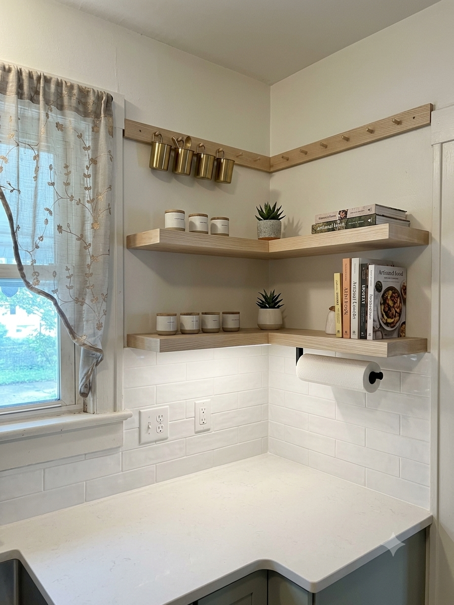
This is an AI image to show what the space COULD look like. Makes it easier for Boccolinis customers to “see” it first
(Image B: Scandinavian Open Plan) Replacing heavy uppers with floating shelves and light-reflective surfaces creates an immediate feeling of spaciousness.
2. The Bright Scandinavian "Display & Breathe" Corner (Maximize Airy Feel)
In tight spaces like the one in the customers photo, closed upper cabinetry often makes the entire room feel smaller by cutting off vertical sightlines. This design approach (seen below in Image B) removes the heavy upper cabinet entirely to let the space breathe.
We replace the closed cabinet with minimalist, floating light ash wood shelves. This design uses light and texture rather than heavy bulk storage. The counter (which is now a smooth quartz stone) is kept light and bright. To solve the storage dilemma, we integrate a large 'utility shelf' unit above the window on the left, making use of that often-wasted space without blocking the light. The kitchen corner itself is minimal, holding only curated, beautiful items like ceramic spice jars.
How This Style Enhances the Space:Boccolinis Breakdown
Visual Expansion: Removing the solid upper cabinet instantly pushes back the visual boundaries of the room.
Wasted Space Utilization: The new above-window shelf adds surprising utility.
Light Maximization: The clean, reflective surfaces bounce natural light from the window deeper into the kitchen.
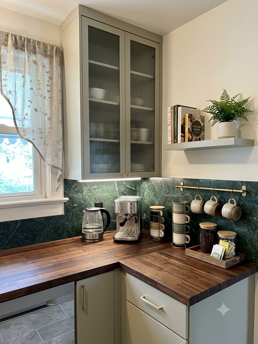
This is an AI image to show what the space COULD look like. Makes it easier for Boccolinis customers to “see” it first
(Image C: The Butler’s Haven) Dedicating the corner to a specialized purpose, like this intimate coffee and tea station, makes an inefficient space suddenly useful and intentional.
3. The Cozy "Hidden Haven" Butler’s Nook (Maximize Style and Surprise)
This third design concept (seen in Image C) doesn't seek to maximize prep space or lightness. Instead, it redefines the purpose of the corner, turning it into a dedicated, high-style feature area. It recognizes that this nook in the customers photo is too small to be a useful primary prep zone.
In this transformation, we replace the upper cabinet with a beautiful, tall, reeded-glass cabinet, adding depth and texture while partially obscuring the items inside (perfect for hiding necessary but non-curated items). The original clutter is gone, replaced entirely by a dedicated coffee and tea station. The original dark mosaic backsplash is replaced by a luxurious dark green marble, which adds immediate drama. The countertop is updated to warm wood. The lighting is focused, creating an intimate "hidden haven."
How This Style Enhances the Space:Boccolinis Breakdown
Creates a Destination: The nook is no longer just "the messy corner," but a beautiful coffee station or a charming butler's pantry for entertaining.
Texture Over Bulk: Reeded glass and green marble add high design without making the room feel enclosed.
Specialized Utility: A space that is too small for general prep is now perfectly sized for a specific daily ritual (making coffee).
Which Efficient Corner is Right For You?
Don't let a small kitchen corner dictate your culinary life. Whether you need an efficient chef’s workspace, an open and airy Scandinavian feel, or a charming dedicated coffee nook, your targeted remodel is a path to regaining your space.
Contact Boccolinis today to discuss which transformation is right for your South Jersey home.
